Improving Efficiency and Experience through a Customizable Interface: BNI CC
Improving Efficiency and Experience through a Customizable Interface: BNI CC
Bank Negara Indonesia (BNI) is one of Indonesia’s largest and oldest state-owned banks, established in 1946. Accelerated by the COVID-19 pandemic, BNI partnered with Privy to transform its credit card application process into a faster and more accessible online experience.
Bank Negara Indonesia (BNI) is one of Indonesia’s largest and oldest state-owned banks, established in 1946. Accelerated by the COVID-19 pandemic, BNI partnered with Privy to transform its credit card application process into a faster and more accessible online experience.
Client
BNI
industry
Financial Services
role
ui/ux designer
tools
Figma, pencil, and paper
duration
4 days
Year
2024
current situation
After launching the online credit card application, including the customer-facing interface for applicants and the internal dashboard for content setup, we gathered feedback from BNI's internal teams. This feedback highlighted two key challenges:
Dashboard limitations
The dashboard offers several key features. Administrators can upload user data, send reminders via email and SMS to customers to encourage them to continue their application process, set up card and create leads/ promotions related to credit card offerings. Despite these functionalities, the existing dashboard presented significant challenges in creating diverse themes and supporting multiple card variants for brand-specific promotions with partners like Batik Air, MAPClub, and Garuda Indonesia.
As a result, customizing the interface for each partner required manual coordination between teams, leading to delays and inefficiencies.
Credit Card Application Experience
For customers, the application journey felt like a complex process. The core issue was the excessive number of steps combined with mandatory manual data entry for every field, which made the experience feel long and repetitive.
the challenge
To address this challenge, I was tasked as the UI/UX Designer to develop solutions that reduce inefficiencies from manual coordination, streamline the leads/promotion creation process, and improve the Credit Card application experience. I approached this project using the design thinking process and maintained ongoing communication with the client.
To address this challenge, I was tasked as the UI/UX Designer to develop solutions that reduce inefficiencies from manual coordination, streamline the leads/promotion creation process, and improve the Credit Card application experience. I approached this project using the design thinking process and maintained ongoing communication with the client.
DESIGN PROCESS
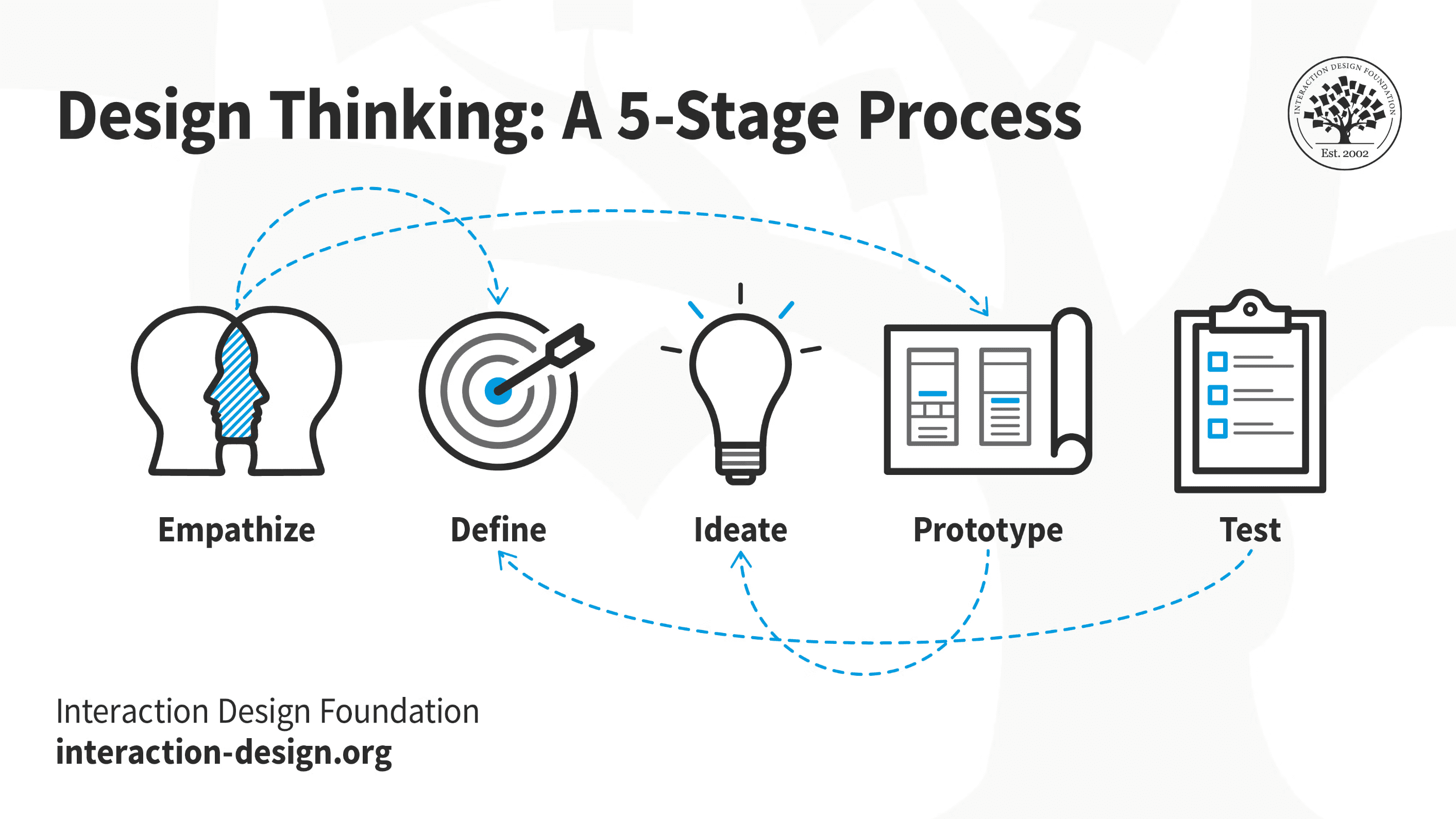
empathise
User Drop-Off Notice on BNI CC application process
(Credit Card Application Experience)
Based on metrics provided by the Project Manager, we observed a significant drop-off in the online credit card application flow. This immediately prompted an investigation into potential blockers hindering users from completing the process. The existing application flow is structured into five steps where each step requires manual data entry for every field: Personal Data, Liveness/Face Verification, Employment Information, Emergency Contact & Other document, Term & Condition, Summary Data.
I conducted meetings to analyze user feedback, and we hypothesized that the long process combined with the burden of extensive manual data entry made users perceive the application as overly complex and tedious, ultimately leading to drop-offs.
Interview with BNI Internal teams
(Dashboard)
We also conducted meetings with BNI’s internal teams to understand their pain points with the current dashboard system. We uncovered key challenges in the process of publishing leads or promotions for specific brand partners. The existing lead creation flow involved multiple layers of communication, starting from BNI’s marketing team to Privy’s marketing team, then moving through the project manager before finally reaching the product team. This back-and-forth often took up to three working days, making the process time-consuming and inefficient.

define
Based on the insights gathered during the understanding phase, I create How Might We (HMW) questions to guide the ideation process.
(Dashboard)
How might we enable BNI's internal teams to easily create and manage diverse brand promotion themes and multiple card variants without manual coordination?
(Credit Card Application Experience)
HMW simplify the credit card application journey for customers so it feels quick, intuitive, and minimizes repetitive manual data entry?
I focused on generating and refining concepts to directly address the "How Might We" questions.
ideate
Idea exploration
(Dashboard)
My ideation process began with brainstorming a wide range of solutions aimed at simplifying the creation and management of diverse brand promotions and multiple card variants. After that, I narrowed down the ideas to a core concept: developing a customization feature within the 'Leads' menu specifically for card leads/ promotions.
(Credit Card Application Experience)
Addressing the complexities of the customer-facing application flow, I conducted an audit of the current experience to identify opportunities for improvement. Several changes were proposed, including:
Revamping the overall design and flow to support customization while maintaining ease of use. A key consideration was defining interface limitations to preserve visual hierarchy and ensure aesthetic appeal. This means that even if users select high-contrast colors, the design remains visually appealing and user-friendly, preventing the interface from becoming cluttered or difficult to navigate.
Reorganizing Information: Restructuring the application steps and grouping related content into manageable chunks. Additionally, progressive disclosure was implemented, revealing specific fields only when relevant options were selected and hiding optional fields by default. These changes aimed to reduce cognitive load, improve clarity, and speed up the application process.
Adding Illustrations and a Success Page: Incorporating engaging visuals and a celebratory success page at the end of the application to enhance the user’s emotional experience. This strategy leverages the "peak-end rule," a psychological principle suggesting that people judge an experience largely based on how they felt at its most intense point (the "peak") and at its end (the "end").
Steps Indicators for Continued Applications: Designing clear progress indicators for users returning to their application after receiving system reminders, so they can easily pick up where they left off.
Proposed Field Reduction: Identifying and recommending the removal of redundant fields to further streamline and accelerate the application process.
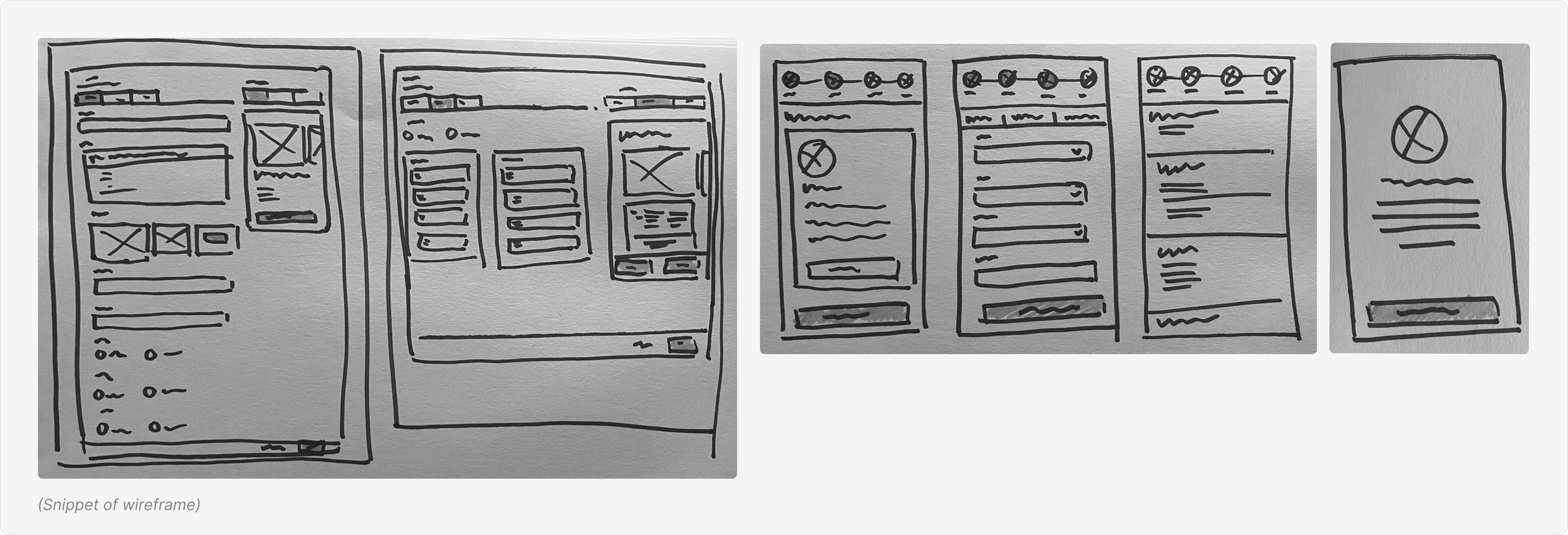
Wireframe
Following this, I proceeded to create wireframes to visually outline the structure and functionality of these proposed changes. I then conducted meetings with the BNI team to secure their buy-in, which resulted in an additional feature request for the dashboard: the ability to reorganize card variations, directly impacting the order of credit card options displayed on the application flow.
In a second iteration of client meetings, further feedback led to the integration of a new feature for the credit card application flow: login with Privy. This integration allows users to bypass manual input for certain personal data fields already verified through the Directorate General of Population and Civil Registration (DUKCAPIL) system, significantly improving efficiency for the applicant.
Idea exploration
(Dashboard)
My ideation process began with brainstorming a wide range of solutions aimed at simplifying the creation and management of diverse brand promotions and multiple card variants. After that, I narrowed down the ideas to a core concept: developing a customization feature within the 'Leads' menu specifically for card leads/ promotions.
(Credit Card Application Experience)
Addressing the complexities of the customer-facing application flow, I conducted an audit of the current experience to identify opportunities for improvement. Several changes were proposed, including:
Revamping the overall design and flow to support customization while maintaining ease of use. A key consideration was defining interface limitations to preserve visual hierarchy and ensure aesthetic appeal. This means that even if users select high-contrast colors, the design remains visually appealing and user-friendly, preventing the interface from becoming cluttered or difficult to navigate.
Reorganizing Information: Restructuring the application steps and grouping related content into manageable chunks. Additionally, progressive disclosure was implemented, revealing specific fields only when relevant options were selected and hiding optional fields by default. These changes aimed to reduce cognitive load, improve clarity, and speed up the application process.
Adding Illustrations and a Success Page: Incorporating engaging visuals and a celebratory success page at the end of the application to enhance the user’s emotional experience. This strategy leverages the "peak-end rule," a psychological principle suggesting that people judge an experience largely based on how they felt at its most intense point (the "peak") and at its end (the "end").
Steps Indicators for Continued Applications: Designing clear progress indicators for users returning to their application after receiving system reminders, so they can easily pick up where they left off.
Proposed Field Reduction: Identifying and recommending the removal of redundant fields to further streamline and accelerate the application process.
Wireframe
Following this, I proceeded to create wireframes to visually outline the structure and functionality of these proposed changes. I then conducted meetings with the BNI team to secure their buy-in, which resulted in an additional feature request for the dashboard: the ability to reorganize card variations, directly impacting the order of credit card options displayed on the application flow.
In a second iteration of client meetings, further feedback led to the integration of a new feature for the credit card application flow: login with Privy. This integration allows users to bypass manual input for certain personal data fields already verified through the Directorate General of Population and Civil Registration (DUKCAPIL) system, significantly improving efficiency for the applicant.
design
Once I had a clear design direction, I proceeded to create high-fidelity designs for both the dashboard and the CC application flow. I developed two key design examples: one showcasing the default theme without customization on the dashboard, and another illustrating a customized application flow for a specific partner (ex: BNI x Batik Air). These designs were then presented and validated in follow-up meetings with the BNI team.
(Dashboard)
In the leads menu on the dashboard, admins can add multiple cards to a single promotion, easily reorder them, and customize the color theme to match the partnered brand. For card settings, admins can split the selection across multiple pages for easier navigation. To ensure accuracy, a real-time preview of the promotion page on the customer side is integrated to the right, updating instantly as admins make content changes.
(Credit Card Application Experience)
In the Credit Card Application flow, users can apply for multiple credit cards from a single promotional page. Additionally, users can choose to fill in their data using Privy or input it manually. The key difference is that Privy automatically populates some personal data fields. The application steps have also been reduced to four, with the final step being Terms & Conditions. Furthermore, in the third step (*Data Pelengkap*), I chunked the fields into specific thematic tabs, helping users stay focused on particular data entry tasks. Finally, illustrations were added to enhance the interface and elevate the user's emotional experience.

testing
Cosmetic Check
Once the designs were finalized, I collaborated closely with the engineering team to conduct a thorough cosmetic check. This crucial step ensured that the implemented interface aligned with the approved design specifications, preserving visual consistency, usability, and overall quality.
User Acceptance Testing
Following the cosmetic checks, the application proceeded to user acceptance testing (UAT). This involved real users interacting with the developed features. Based on observations and feedback gathered during UAT, we identified several key areas for improvement:
Refining micro-interactions on card selection to clearly highlight chosen cards, especially since users can apply for multiple credit cards in a single process.
Refining the instructional text on the liveness/face verification step to minimize user errors.
Adding an illustration before the final steps to visually communicate progress and reassure users they are nearing completion.
I updated the design based on these insights, ensuring the final product delivered an even more seamless and intuitive user experience.
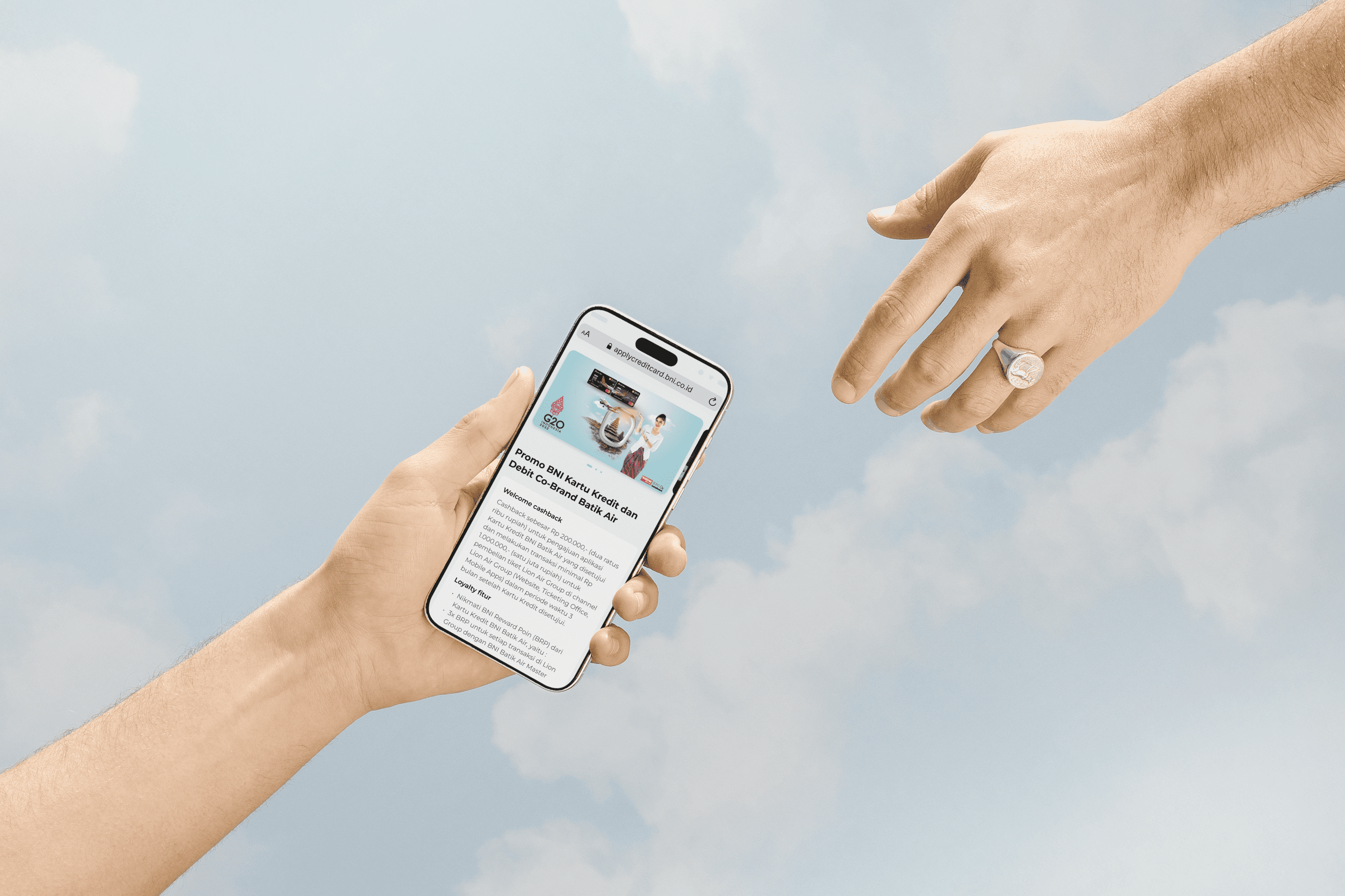
👉🏻 To see the live version, please visit: https://applycreditcard.bni.co.id/bni
Cosmetic Check
Once the designs were finalized, I collaborated closely with the engineering team to conduct a thorough cosmetic check. This crucial step ensured that the implemented interface aligned with the approved design specifications, preserving visual consistency, usability, and overall quality.
User Acceptance Testing
Following the cosmetic checks, the application proceeded to user acceptance testing (UAT). This involved real users interacting with the developed features. Based on observations and feedback gathered during UAT, we identified several key areas for improvement:
Refining micro-interactions on card selection to clearly highlight chosen cards, especially since users can apply for multiple credit cards in a single process.
Refining the instructional text on the liveness/face verification step to minimize user errors.
Adding an illustration before the final steps to visually communicate progress and reassure users they are nearing completion.
I updated the design based on these insights, ensuring the final product delivered an even more seamless and intuitive user experience.
👉🏻 To see the live version, please visit: https://applycreditcard.bni.co.id/bni
impact
The dashboard enhancements aimed to empower BNI's internal teams, resulting in greater efficiency and flexibility. The time required by the admin to set up a new credit card promotion, including creating themes, and card variants, was reduced to less than one day. Crucially, the need for manual coordination was eliminated, allowing BNI teams to focus on more strategic tasks rather than administrative overhead.
On the other hand, improvements to BNI’s credit card application flow led to a notable reduction in the drop-off rate, from around 20% to less than 10%. The new flow also received positive feedback from customers, who appreciated the shorter steps, clearer instructions, and more intuitive interface, which made the application process feel more efficient and manageable.
takeaway
Reflecting on this design process, I learned the importance of balancing customization options on the dashboard with maintaining visual hierarchy and interface appeal on the customer-facing side. I also gained valuable experience in effective communication, particularly in securing buy-in for my design decisions from all stakeholders. Furthermore, communicating my design choices early with the engineering team and Project Manager significantly fostered the entire design process. Moving forward, we'll continue to track performance metrics and user feedback to implement future improvements.
Reflecting on this design process, I learned the importance of balancing customization options on the dashboard with maintaining visual hierarchy and interface appeal on the customer-facing side. I also gained valuable experience in effective communication, particularly in securing buy-in for my design decisions from all stakeholders. Furthermore, communicating my design choices early with the engineering team and Project Manager significantly fostered the entire design process. Moving forward, we'll continue to track performance metrics and user feedback to implement future improvements.