Increase purchase decision by Revamping “one page”: Binar Academy
Increase purchase decision by Revamping “one page”: Binar Academy
As a UI/UX Designer at Binar Academy, I was tasked with enhancing the Premium page's conversion rate. Leveraging Product Manager insights that highlighted a considerable user drop-off before payment, my objective was to redesign the experience to be more compelling and intuitive, thereby reducing this drop-off.
As a UI/UX Designer at Binar Academy, I was tasked with enhancing the Premium page's conversion rate. Leveraging Product Manager insights that highlighted a considerable user drop-off before payment, my objective was to redesign the experience to be more compelling and intuitive, thereby reducing this drop-off.
Client
BInar academy
industry
education technology (Edtech)
role
UI/UX Designer
tools
Figma, Miro, Maze, Pencil and Paper
duration
2 weeks
Year
2021

current situation
About Binar Academy
Binar Academy is an Ed-tech platform that focusing on developing professional digital skills. The platform offers a wide range of courses covering topics relevant to various digital professions, such as UI/UX Design, Web Development, and Product Management.
Students can use the Binar app on both iOS and Android platforms to enroll in courses. The app provides access to a variety of learning options, including bootcamps, webinars, and on-demand videos, allowing students to choose the method that suits them best.
the challenge
The data analytics for the Premium page, provided by the Product Manager (PM), have shown a low conversion rate from the ‘Premium page’ to ‘Payment initiated’. This discovery initiated an iterative revamp process for the page.
The data analytics for the Premium page, provided by the Product Manager (PM), have shown a low conversion rate from the ‘Premium page’ to ‘Payment initiated’. This discovery initiated an iterative revamp process for the page.
DESIGN PROCESS
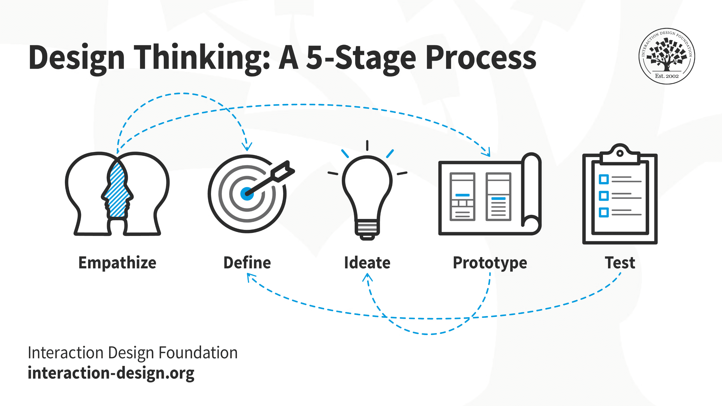
empathise
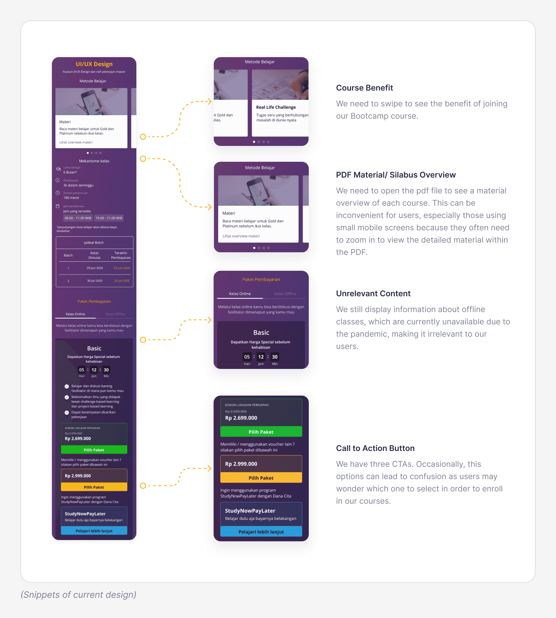
User Drop-Off Notice
Based on detailed metrics provided by our Product Manager, we notice a significant drop-off of users on our Bootcamp premium page. We decided to investigate this page to identify any factors that may be a blocker for users from finding the information they need to complete a purchase.
Pain Point in The Current Version
We conducted analysis of Heatmap data that show where users were dropping off at various points on the page, often without clicking on the call-to-action (CTA) button.
Our hypothesis is rooted in the limitations of information in the current premium page such as the course designer, testimonials, the learning process, and more. Furthermore, we hypothesize that users who come to the premium page on our mobile app do not see enough value from Bootcamp to justify the investment. Here the detail issue we found:
define
I gathered insights from the interviews and created "How Might We" (HMW) questions to frame the problems for ideation.
How might we help users quickly grasp essential information that supports decision-making for Bootcamp courses?
I gathered insights from the interviews and created "How Might We" (HMW) questions to frame the problems for ideation.
How might we help users quickly grasp essential information that supports decision-making for Bootcamp courses?
ideate
In order to understand user perspective on our premium page and identify their priorities in decision-making process, our team conducted a brainstorming session using Miro. Our goal was to identify the key challenges, including:
Making it easy for users to see the benefits of Bootcamp.
Making it easy for users to access Bootcamp materials.
Add quantitative social proof to convince users that our Bootcamp product is a safe and reliable option.
Making it easy for users to know about ongoing special prices. Currently, this information is available in the "Price" section only.
Providing users with a visual representation of Bootcamp learning stages.
Adding content to showcase more value from our Bootcamp program, including student outcome skills, testimonials, companies that recruit our graduates, and examples of Binar's students' final projects.
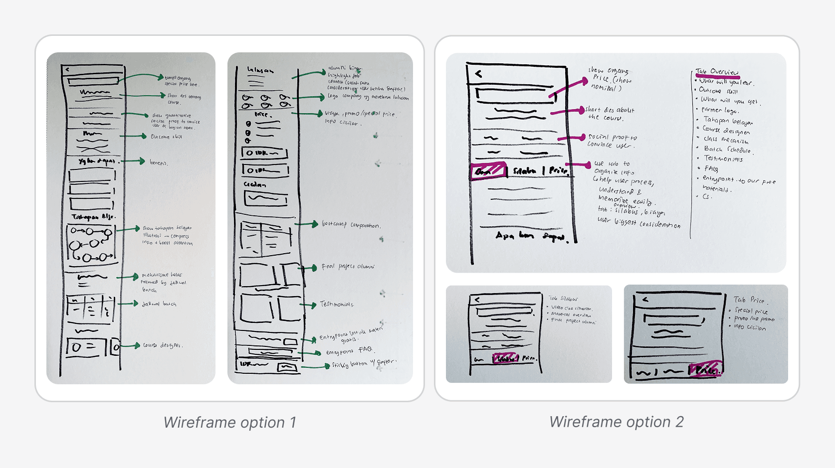
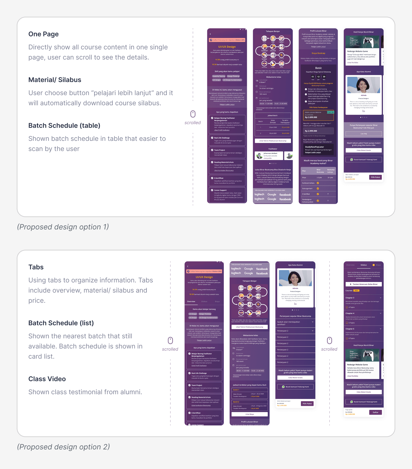
Wireframing
With the collected information, I created wireframe variations. These were shared with our internal team for testing and feedback, helping me refine and narrow them down to two variations. I use this wireframe to produce a Mid-Fi design.
In order to understand user perspective on our premium page and identify their priorities in decision-making process, our team conducted a brainstorming session using Miro. Our goal was to identify the key challenges, including:
Making it easy for users to see the benefits of Bootcamp.
Making it easy for users to access Bootcamp materials.
Add quantitative social proof to convince users that our Bootcamp product is a safe and reliable option.
Making it easy for users to know about ongoing special prices. Currently, this information is available in the "Price" section only.
Providing users with a visual representation of Bootcamp learning stages.
Adding content to showcase more value from our Bootcamp program, including student outcome skills, testimonials, companies that recruit our graduates, and examples of Binar's students' final projects.
Wireframing
With the collected information, I created wireframe variations. These were shared with our internal team for testing and feedback, helping me refine and narrow them down to two variations. I use this wireframe to produce a Mid-Fi design.
design
I create high fidelity design on Figma, which would then be used in concept testing.
I create high fidelity design on Figma, which would then be used in concept testing.
testing
I conducted concept testing to gain insights into factors that influence user's decision-making process when selecting a Bootcamp course, aiming to understand the most effective design for conveying the value of our Bootcamp quickly. This process also involved evaluating our proposed concepts to gather feedback necessary for making final decisions.
The participants in this testing consisted of two users who hadn't converted (to understand their reasons for not making a purchase) and two converted users who had interacted with our Customer Service (to identify the information they sought from our CS team during their purchasing process). We conducted prototype testing, followed by interviews with additional follow-up questions.
Interviews were conversational and tailored to each user.
Learning
From the concept testing, we learn that the factor that influences user decision include Bootcamp materials, benefit, schedule, price, testimonials, and alumni final assignments (which help users especially those with a non-tech background to understand the Bootcamp project).
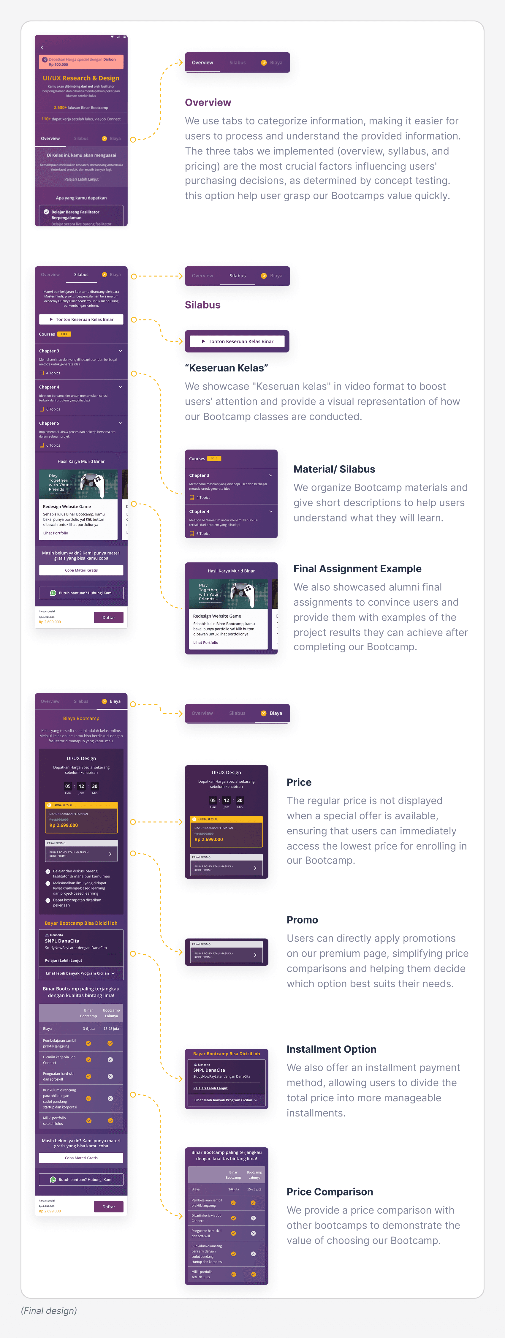
During testing, users encountered difficulty viewing detailed material in design option 1 (where all information was presented on a single page), whereas they found option 2 (with content organized using tabs) more user-friendly. These insights informed the content structure and guided the creation of the Hi-Fi Design.
I adjusted content arrangements based on concept testing results before delivering the final high-fidelity experience for the Premium Page.
I conducted concept testing to gain insights into factors that influence user's decision-making process when selecting a Bootcamp course, aiming to understand the most effective design for conveying the value of our Bootcamp quickly. This process also involved evaluating our proposed concepts to gather feedback necessary for making final decisions.
The participants in this testing consisted of two users who hadn't converted (to understand their reasons for not making a purchase) and two converted users who had interacted with our Customer Service (to identify the information they sought from our CS team during their purchasing process). We conducted prototype testing, followed by interviews with additional follow-up questions.
Interviews were conversational and tailored to each user.
Learning
From the concept testing, we learn that the factor that influences user decision include Bootcamp materials, benefit, schedule, price, testimonials, and alumni final assignments (which help users especially those with a non-tech background to understand the Bootcamp project).
During testing, users encountered difficulty viewing detailed material in design option 1 (where all information was presented on a single page), whereas they found option 2 (with content organized using tabs) more user-friendly. These insights informed the content structure and guided the creation of the Hi-Fi Design.
I adjusted content arrangements based on concept testing results before delivering the final high-fidelity experience for the Premium Page.
impact
After one month new premium page design was implemented, Conversion rate from "Premium page" to "Payment initiated" increased 3% compared to the same cycle last month. This shows that our design complete the given challenge.
After one month new premium page design was implemented, Conversion rate from "Premium page" to "Payment initiated" increased 3% compared to the same cycle last month. This shows that our design complete the given challenge.
takeaway
Revamping one page is really challenging. I enjoy doing all the processes, I carefully think about design decisions and the impact we want to get. Collaborating with the Design Manager and PM is very helpful in the design process.
And that's just the beginning, After this project, we continue monitoring our metric and improving our design.